My full-stack ambition has led me to Sketch. I always wanted to learn how to use photoshop or illustrator but never quiet had the time. I started using Sketch a few weeks ago after stumbling on this article. Sketch is a fairly new designer-centric application that’s really gaining popularity. Sketch is primarily focused on user interface design. Everything is already in vector, so you don’t have to worry about designing for multiple devices, and delivering assets is a breeze. It’s super lean and intuitive, the interface is bare bones and not nearly as cluttered as photoshop and illustrator. Programmers are notorious for opposing anything that has to do with design and with bloated adobe products you can’t really blame them. I argue that the wider your range of expertise the more valuable you are. And honestly making something like a neat logo, as I’ll demonstrate in this post, isn’t terribly difficult in Sketch!
Let me briefly discuss some of the awesome features in sketch that any full-stack developer would appreciate. If you’re wireframing in Sketch you don’t have to worry about your design translating to CSS. So all of the textures, gradients, shadows etc… are easily coded for. This is because all of the tools in sketch can only produce attributes that can be converted to CSS. With photoshop you can go crazy with all the options available and have a very hard time translating your outlandish design to CSS. If you’re familiar with Rails you know how many decisions are made for you so you don’t have to waste time, Rails confines you but in a very good way. Any design in Sketch can easily be exported to the web. Many designers use ~3 different apps for 3 different tasks: wireframing, UI design, and vector logo graphics. Sketch is a one stop shop for all 3 of these tasks. Lastly, familiarity with grid systems is essential to building responsive sites. Sketch has a customizable grid system. Most of the time you’ll probably be using the default 12-columns but sometimes you’ll want to fit more content on the page and go with 16-columns.
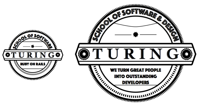
These are the 2-logos I was able to sketch, with Sketch…. hi-hat! I’m currently a student at Turing so I figured why not redesign the school logo. Turing is mainly a back-end developer program so design excursions like this are usually side projects. So how does someone with zero experience with this software quickly build a neat vector logo? Designing like anything else is essentially problem solving, and the best approach is to break everything down into tiny manageable chunks, just like programming. I sketched some stuff in my notebook to kinda have an idea of what I wanted and took it from there.
I split the logo up into a bunch of pieces: circles, lines, and text. Creating and styling each element taught me a little bit more about the software and anything I got stuck on I would google or find the 1-person I know who uses it. The biggest challenge was getting text to neatly wrap around an oval or any shape for that matter, thankfully Sketch has something called “Text on Path.” Believe it or not the big-logo on the right consists of 22-peices, 19-peices for the one on the right! After building all of the components separately I chunked some of them together for the assembly process, and wa-lah!
